Web Design

Portfolio website
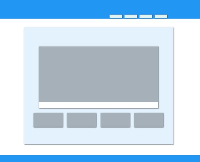
This website is one of my more recent web design projects, made with HTML5, CSS3, and a few light JavaScript/JQuery elements. The site is fully width-responsive for mobile devices by using media queries and breakpoints.
The style of the site is heavily influenced by Google's Material Design. It features simple, bold colors with layering effects to create the illusion of depth, as if it were a physical material, and not just an image on a page. I wanted it to be quick and responsive to give the user tactile feedback, as if they were actually touching the elements.
I wanted to make this site very adaptable, so I could easily and new projects. The image grids are made with Flex containers, making it very easy to add new elements as they arrange themselves automatically. Normally, if there is not enough space for another full element in a row of the grid, the Flex container will add white space between the elements evenly. I altered the container to fill the available width on the page by automatically resizing the images until a threshold is reached, when the container adds another element in the row.
External tools used: Slick image carousel, Ken Wheeler (MIT license)